
What is CSS drop-shadow, exactly?
In CSS, “drop shadow” usually means the filter: drop-shadow(...) function.
It’s a shadow that’s computed from the visible pixels of an element (think:
“shadow of the silhouette”), which makes it perfect for transparent PNGs, SVGs, and
weird-shaped things.
That’s different from box-shadow, which shadows the element’s box
(rectangle + border radius). Box shadows are amazing… but they can’t “follow” the
transparent shape inside a PNG.
drop-shadow() syntax and the mental model
The function looks like this:
filter: drop-shadow(x-offset y-offset blur-radius color);
- x-offset moves the shadow left/right (negative values go left).
- y-offset moves the shadow up/down (negative values go up).
- blur-radius softens the shadow (0px is crisp).
-
color can be named, hex,
rgb(),rgba(),hsl(), etc.
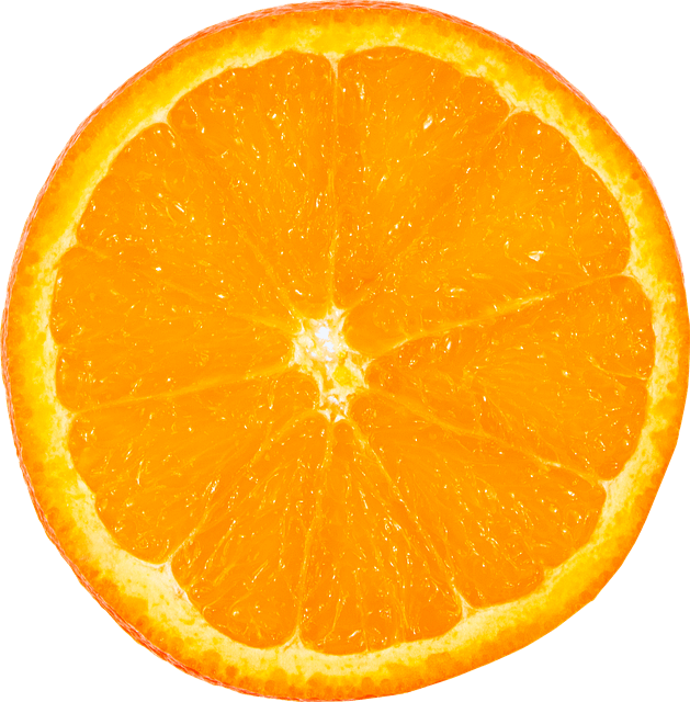
The key idea: drop-shadow uses the element’s rendered pixels as a mask. If your image has transparent areas, the shadow respects them.
.sticker {
  filter: drop-shadow(0px 16px 18px rgba(0, 0, 0, 0.35));
}
.sticker {
  filter: drop-shadow(18px 8px 10px rgba(0, 0, 0, 0.28));
}
.sticker {
  filter: drop-shadow(-14px 10px 6px rgba(0, 0, 0, 0.22));
}
*,
::before,
::after {
  box-sizing: border-box;
}

.wrap {
  min-height: 320px;
  display: grid;
  place-items: center;
  padding: 24px;
  background: #f4f5f7;
  font-family: ui-sans-serif, system-ui, sans-serif;
}

.sticker {
  width: 260px;
  height: auto;
  display: block;
}
CSS drop-shadow vs box-shadow
Here’s the practical difference you’ll feel immediately:
-
box-shadowshadows the element’s box (rectangle / border-radius). Great for cards, buttons, panels. -
filter: drop-shadow()shadows the element’s visible pixels (silhouette). Great for PNGs with transparency, SVG icons, cut-out shapes.
Let’s compare them on a transparent PNG. Notice how box-shadow looks like a
“shadowed rectangle”, while drop-shadow() hugs the actual object.
.photo {
  box-shadow: 0px 18px 22px rgba(0, 0, 0, 0.28);
}
.photo {
  filter: drop-shadow(0px 18px 22px rgba(0, 0, 0, 0.28));
}
*,
::before,
::after {
  box-sizing: border-box;
}

.grid {
  min-height: 360px;
  display: grid;
  place-items: center;
  padding: 24px;
  background: #f3f4f6;
  font-family: ui-sans-serif, system-ui, sans-serif;
}

.card {
  width: min(520px, 92vw);
  background: #ffffff;
  border: 1px solid #e7e7e7;
  border-radius: 18px;
  padding: 18px;
}

h3 {
  margin: 0 0 10px 0;
  font-size: 16px;
}

.photo {
  width: 280px;
  height: auto;
  display: block;
  margin: 0 auto;
}
Same PNG, different shadow technique
When to use which
-
Use
box-shadowfor UI surfaces (cards, modals, buttons). It’s fast, predictable, and has a spread parameter. -
Use
drop-shadow()when the element’s silhouette matters (transparent PNGs, SVG icons, irregular shapes).
Learn more about box-shadow in the CSS Box Shadow Interactive Tutorial.
Tuning the three main knobs: offset, blur, color
Most “good shadows” are just a nice combination of: a small vertical offset, a moderate blur, and a semi-transparent color. Let’s make those values interactive with range sliders.
This playground controls the numeric values inside drop-shadow(x y blur color).
.hero-img {
  filter: drop-shadow(0px 16px 22px rgba(0, 0, 0, 0.30));
}
*,
::before,
::after {
  box-sizing: border-box;
}

.scene {
  min-height: 380px;
  display: grid;
  place-items: center;
  padding: 24px;
  background: radial-gradient(circle at 30% 20%, #ffffff 0%, #f2f3f6 55%, #e9ebf0 100%);
  font-family: ui-sans-serif, system-ui, sans-serif;
}

.hero {
  width: min(560px, 94vw);
  background: #ffffff;
  border: 1px solid #e6e6e6;
  border-radius: 20px;
  padding: 18px;
}

.hero h4 {
  margin: 0 0 12px 0;
  font-size: 16px;
}

.hero-img {
  width: 300px;
  height: auto;
  display: block;
  margin: 6px auto 0 auto;
}
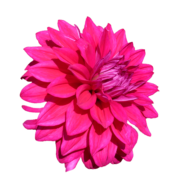
Drag the sliders: offset + blur
Quick beginner guidelines
- A natural “floating” shadow is often more blur than offset.
- If the shadow looks dirty, reduce blur or reduce alpha (opacity).
- If the shadow looks like it’s detached, reduce the offset a bit.
CSS drop-shadow opacity
There are two common ways to control drop-shadow opacity:
-
Set alpha in the shadow color (recommended):
rgba(0, 0, 0, 0.35). -
Make the whole element semi-transparent (usually not what you want):
opacity: 0.7. That fades the element itself too.
Let’s compare. One snippet changes the shadow alpha, the other fades the entire element.
.demo-img {
  filter: drop-shadow(0px 18px 22px rgba(0, 0, 0, 0.12));
}
.demo-img {
  filter: drop-shadow(0px 18px 22px rgba(0, 0, 0, 0.42));
}
.demo-img {
  filter: drop-shadow(0px 18px 22px rgba(0, 0, 0, 0.30));
  opacity: 0.65;
}
*,
::before,
::after {
  box-sizing: border-box;
}

.stage {
  min-height: 380px;
  display: grid;
  place-items: center;
  padding: 24px;
  background: #f4f5f7;
  font-family: ui-sans-serif, system-ui, sans-serif;
}

.panel {
  width: min(560px, 94vw);
  background: #ffffff;
  border: 1px solid #e6e6e6;
  border-radius: 18px;
  padding: 18px;
}

.panel p {
  margin: 0 0 12px 0;
  font-size: 14px;
  line-height: 1.4;
}

.demo-img {
  width: 280px;
  height: auto;
  display: block;
  margin: 0 auto;
}
Compare: low alpha shadow, high alpha shadow, and opacity on the element.
CSS drop-shadow spread (the honest truth)
drop-shadow() does not have a spread parameter.
If you’re coming from box-shadow, this feels like, “Wait… where’s my spread slider?”
Yep. That’s the trade-off.
Why there’s no spread
box-shadow draws a shadow for a box shape, and it can expand/shrink that shape (spread).
drop-shadow() is based on the element’s pixels, so “spreading” the silhouette is not part
of its basic model.
Spread workarounds you can actually use
- Stack multiple drop-shadows: one tight, one blurrier. This can feel like “spread + blur”.
- Use an SVG filter if you truly need morphological expansion (advanced, but possible).
- Fake an outline glow by using several drop-shadows at different offsets (looks like thickness).
Let’s do the most common workaround: stacking two drop-shadows.
.cutout {
  filter: drop-shadow(0px 10px 10px rgba(0, 0, 0, 0.25));
}
.cutout {
  filter:
    drop-shadow(0px 10px 10px rgba(0, 0, 0, 0.18))
    drop-shadow(0px 26px 26px rgba(0, 0, 0, 0.14));
}
.cutout {
  filter:
    drop-shadow(0px 8px 0px rgba(0, 0, 0, 0.12))
    drop-shadow(0px 20px 22px rgba(0, 0, 0, 0.16));
}
*,
::before,
::after {
  box-sizing: border-box;
}

.canvas {
  min-height: 380px;
  display: grid;
  place-items: center;
  padding: 24px;
  background: #f1f2f4;
  font-family: ui-sans-serif, system-ui, sans-serif;
}

.box {
  width: min(560px, 94vw);
  background: #ffffff;
  border: 1px solid #e6e6e6;
  border-radius: 18px;
  padding: 18px;
}

.box p {
  margin: 0 0 12px 0;
  font-size: 14px;
  line-height: 1.4;
}

.cutout {
  width: 290px;
  height: auto;
  display: block;
  margin: 0 auto;
}
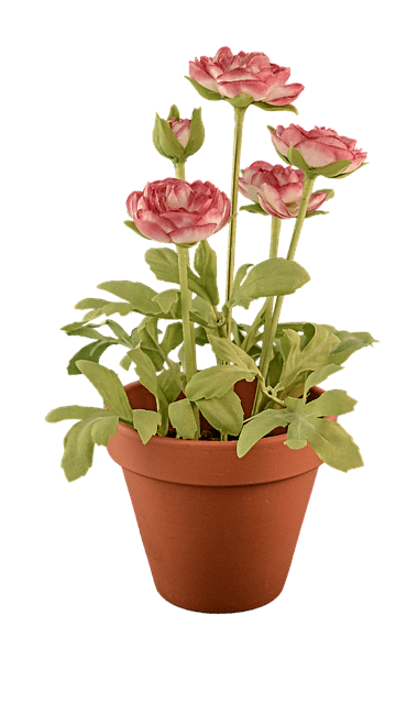
Single shadow vs stacked shadows (often the easiest “spread-ish” trick).
CSS drop shadow text
There are two main ways to shadow text:
-
text-shadow: built for text, very common, very controllable. -
filter: drop-shadow()on the element: shadows the rendered pixels of the text, which can look slightly different (and can apply to more than just glyphs if the element also contains icons).
Beginners tip: start with text-shadow. Use drop-shadow() on text when you want
the effect to match other drop-shadowed elements, or you want to shadow the “whole rendered thing” (text + inline
SVG).
.title {
  text-shadow: 0px 10px 18px rgba(0, 0, 0, 0.30);
}
.title {
  filter: drop-shadow(0px 10px 18px rgba(0, 0, 0, 0.30));
}
.title {
  text-shadow:
    0px 8px 12px rgba(0, 0, 0, 0.22),
    0px 18px 26px rgba(0, 0, 0, 0.16);
}
*,
::before,
::after {
  box-sizing: border-box;
}

.hero {
  min-height: 360px;
  display: grid;
  place-items: center;
  padding: 24px;
  background: radial-gradient(circle at 40% 30%, #ffffff 0%, #f2f3f6 45%, #e9ebf0 100%);
  font-family: ui-sans-serif, system-ui, sans-serif;
}

.card {
  width: min(760px, 94vw);
  background: #ffffff;
  border: 1px solid #e6e6e6;
  border-radius: 20px;
  padding: 26px;
}

.title {
  margin: 0;
  font-size: clamp(34px, 5vw, 46px);
  line-height: 1.05;
  letter-spacing: -0.02em;
}

.sub {
  margin: 12px 0 0 0;
  font-size: 14px;
  opacity: 0.8;
}
    Soft Drop Shadow Text
    Compare text-shadow vs filter: drop-shadow(), then a stacked text-shadow.
Learn more about text-shadow in the CSS Text Shadow Interactive Tutorial.
A practical pattern: text shadow for readability
If text sits on a busy background, a small shadow can increase readability. Keep it soft and low-opacity so it feels like depth, not a cartoon outline.
Multiple drop-shadows: glows and “outline-ish” looks
Just like multiple box-shadow layers, you can stack multiple drop-shadow()
functions by writing them one after another in filter.
This is how you get glows, richer depth, or a faux outline around transparent artwork.
.icon {
  filter:
    drop-shadow(0px 10px 14px rgba(0, 0, 0, 0.22))
    drop-shadow(0px 26px 30px rgba(0, 0, 0, 0.14));
}
.icon {
  filter:
    drop-shadow(0px 0px 14px rgba(40, 140, 255, 0.40))
    drop-shadow(0px 0px 30px rgba(40, 140, 255, 0.22))
    drop-shadow(0px 18px 22px rgba(0, 0, 0, 0.18));
}
.icon {
  filter:
    drop-shadow(0px 0px 0px rgba(0, 0, 0, 0.00))
    drop-shadow(0px 0px 2px rgba(0, 0, 0, 0.30))
    drop-shadow(0px 0px 2px rgba(0, 0, 0, 0.30))
    drop-shadow(0px 18px 22px rgba(0, 0, 0, 0.16));
}
*,
::before,
::after {
  box-sizing: border-box;
}

.stage {
  min-height: 380px;
  display: grid;
  place-items: center;
  padding: 24px;
  background: #0f172a;
  font-family: ui-sans-serif, system-ui, sans-serif;
}

.shell {
  width: min(760px, 94vw);
  background: rgba(255, 255, 255, 0.06);
  border: 1px solid rgba(255, 255, 255, 0.14);
  border-radius: 20px;
  padding: 18px;
  color: rgba(255, 255, 255, 0.88);
}

.shell p {
  margin: 0 0 12px 0;
  font-size: 14px;
  line-height: 1.4;
}

.icon {
  width: 280px;
  height: auto;
  display: block;
  margin: 0 auto;
}
Stacked drop-shadows: depth, glow, and an outline-ish trick.
Common pitfalls and gotchas
1) drop-shadow can expand the visual bounds
Shadows paint outside the element. That’s normal. But if a parent has overflow: hidden,
your shadow might get clipped. If your shadow “mysteriously disappears,” check for overflow.
2) drop-shadow is applied after rendering
Because it’s a filter, it applies to the rendered result. That’s awesome (silhouette shadows), but it also means it can be a bit more expensive than simple box shadows if you go overboard. Use multiple layers with taste.
3) Transparent PNGs are where drop-shadow shines
If your image is a JPEG (no transparency), drop-shadow() and box-shadow
can look similar. Transparent PNGs are where the difference screams “I’m the right tool.”
Hover animation: drop-shadow that feels good
A classic UI move: increase the shadow slightly on hover to feel “lifted.”
With filters, you can animate the filter property. Keep transitions short and subtle.
.tile img {
  filter: drop-shadow(0px 12px 16px rgba(0, 0, 0, 0.22));
  transition: filter 160ms ease, transform 160ms ease;
}

.tile:hover img,
.tile:focus-within img {
filter: drop-shadow(0px 20px 26px rgba(0, 0, 0, 0.22));
transform: translateY(-4px);
}
*,
::before,
::after {
  box-sizing: border-box;
}

.wrap {
  min-height: 420px;
  display: grid;
  place-items: center;
  padding: 24px;
  background: #f4f5f7;
  font-family: ui-sans-serif, system-ui, sans-serif;
}

.tile {
  width: min(520px, 92vw);
  background: #ffffff;
  border: 1px solid #e6e6e6;
  border-radius: 18px;
  padding: 18px;
}

.tile h3 {
  margin: 0 0 10px 0;
  font-size: 16px;
}

.tile p {
  margin: 0 0 14px 0;
  font-size: 14px;
  line-height: 1.45;
  opacity: 0.85;
}

.tile img {
  width: 280px;
  height: auto;
  display: block;
  margin: 0 auto;
}

.tile a {
  color: inherit;
  text-decoration: underline;
}
Hover (or focus) to lift
Small shadow + tiny translate = “this is clickable” energy.
CSS Drop Shadow wrap-up: what to remember
-
box-shadowshadows the box.drop-shadow()shadows the silhouette. -
Opacity is usually controlled in the shadow color (RGBA/HSLA), not with
opacity. -
No spread in
drop-shadow(), but stacking layers often gets you the look you want. -
For text, start with
text-shadow, then reach fordrop-shadow()when it fits the design.
CSS Drop Shadow Conclusion
CSS drop shadows are a versatile tool for adding depth and emphasis to your designs.
By understanding the differences between box-shadow, text-shadow, and drop-shadow(),
you can create more visually appealing and interactive user interfaces.