
What are CSS filters?
CSS filters let you apply “image editor”-style effects (blur, contrast, grayscale, hue rotation…) to an element. The most common use is on images, but filters can also affect videos, backgrounds, and even entire UI blocks.
The key idea: filters don’t change the file. They change how the element is rendered in the browser. So you can experiment freely, animate them, and toggle them per component.
CSS filters are mainly done with the filter property. There’s also backdrop-filter (for filtering what’s behind an element),
but that’s a separate topic (we’ll mention it briefly later).
Filters vs opacity vs transforms
-
filterchanges the pixels (blur, color shift, etc.) of the element as it’s drawn. -
opacity(the property) makes the element and its children transparent. -
transformchanges geometry (move, rotate, scale), not pixel effects.
Learn more about opacity in the CSS Opacity Interactive Tutorial, and about transforms in the CSS Transform Interactive Tutorial.
CSS filter basics: syntax and stacking
The filter property takes one or more filter functions. Each function is applied in order, left to right.
Think of it like a factory line: the result of the first filter goes into the second, and so on.
Common pattern:
filter: none;(no effect)filter: blur(4px);filter: brightness(1.2) contrast(1.1);
.demo-img {
  filter: none;
}
.demo-img {
  filter: grayscale(1);
}
.demo-img {
  filter: grayscale(1) contrast(1.2);
}
.demo-img {
  filter: grayscale(1) contrast(1.2) brightness(1.15);
}
*,
::before,
::after {
  box-sizing: border-box;
}

.demo-wrap {
  display: grid;
  gap: 16px;
  align-items: start;
  font-family: ui-sans-serif, system-ui;
}

.demo-img {
  width: 360px;
  max-width: 100%;
  display: block;
  border-radius: 16px;
  border: 3px solid #111;
}

.note {
  max-width: 60ch;
  font-size: 14px;
  line-height: 1.45;
  opacity: 0.9;
}

Click the snippets to stack filters. Order matters:
contrast()beforebrightness()can feel different than the reverse.
Filter order matters
Filters aren’t commutative (that’s a fancy way of saying “switching their order changes the result”).
For example, a strong contrast() can amplify whatever comes before it.
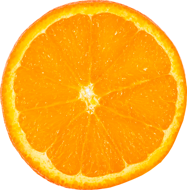
CSS Filter: blur()
blur() takes a length (usually px). Bigger values blur more.
It’s great for “frosted glass” vibes (usually with backdrop-filter), for focusing attention, or for subtle depth.
One gotcha: blur can make edges look like they “spread” outside the element. That’s normal: the blur kernel samples nearby pixels.
.demo-img {
  filter: blur(6px);
}
*,
::before,
::after {
  box-sizing: border-box;
}

.demo-img {
  width: 380px;
  max-width: 100%;
  display: block;
  border-radius: 18px;
  border: 3px solid #111;
  margin: 10px;
}

.wrap {
  display: grid;
  gap: 12px;
  font-family: ui-sans-serif, system-ui;
}

.small {
  font-size: 14px;
  opacity: 0.9;
  max-width: 60ch;
}

Blur is measured in
px. Try going from 0 to 24 and watch details dissolve.
brightness() and contrast()
These two often travel together:
-
brightness()scales lightness.1is normal,0is fully black,2is double-bright. -
contrast()increases or reduces separation between darks and lights.1is normal,0is flat gray, values >1are punchier.
.demo-img {
  filter: brightness(1.1) contrast(1.2);
}
*,
::before,
::after {
  box-sizing: border-box;
}

.grid {
  display: grid;
  gap: 14px;
  font-family: ui-sans-serif, system-ui;
}

.demo-img {
  width: 420px;
  max-width: 100%;
  display: block;
  border-radius: 16px;
  border: 3px solid #111;
}

.tip {
  font-size: 14px;
  opacity: 0.9;
  max-width: 62ch;
}

Try pushing contrast: you’ll lose detail in shadows and highlights (they “clip”).
Common use case: “make it pop”
A light contrast(1.05) and brightness(1.05) is a classic “photo punch” combo.
Keep it subtle unless you’re designing a cyberpunk poster.
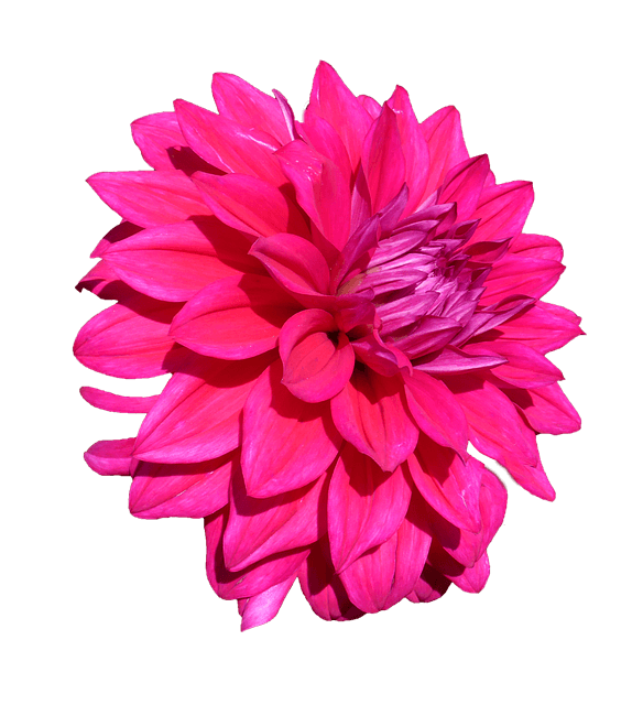
CSS filters: grayscale() and sepia()
These are percentage-like filters:
grayscale(0)is normal color,grayscale(1)is fully grayscale.sepia(0)is normal,sepia(1)is fully sepia (warm brownish tones).
They’re great for “inactive” UI states, image galleries, or retro vibes.
.demo-img {
  filter: grayscale(1);
}
.demo-img {
  filter: sepia(1);
}
.demo-img {
  filter: grayscale(0.9) sepia(0.4);
}
.demo-img {
  filter: grayscale(1) contrast(1.15);
}
*,
::before,
::after {
  box-sizing: border-box;
}

.wrap {
  display: grid;
  gap: 14px;
  font-family: ui-sans-serif, system-ui;
}

.demo-img {
  width: 420px;
  max-width: 100%;
  display: block;
  border-radius: 18px;
  border: 3px solid #111;
}

.help {
  font-size: 14px;
  opacity: 0.9;
  max-width: 62ch;
}

You can blend them: try “mostly grayscale + a touch of sepia” for a moody editorial look.
saturate()
saturate() controls color intensity:
saturate(1)is normalsaturate(0)is effectively grayscalesaturate(2)doubles saturation
It’s a nicer “color boost” knob than messing with hue, because it keeps hues mostly consistent.
.demo-img {
  filter: saturate(1.6);
}
*,
::before,
::after {
  box-sizing: border-box;
}

.demo {
  display: grid;
  gap: 12px;
  font-family: ui-sans-serif, system-ui;
}

.demo-img {
  width: 420px;
  max-width: 100%;
  display: block;
  border-radius: 18px;
  border: 3px solid #111;
}

.note {
  font-size: 14px;
  opacity: 0.9;
  max-width: 62ch;
}

Saturation can get neon-fast. A small increase (like
1.1to1.3) is usually enough for UI.
CSS Filter: hue-rotate()
hue-rotate() spins the color wheel. It takes an angle like deg.
The content keeps roughly the same brightness, but colors shift dramatically.
hue-rotate(0deg)is normalhue-rotate(180deg)is often “opposite-ish” colorshue-rotate(360deg)loops back to normal
.demo-img {
  filter: hue-rotate(120deg);
}
*,
::before,
::after {
  box-sizing: border-box;
}

.stack {
  display: grid;
  gap: 12px;
  font-family: ui-sans-serif, system-ui;
}

.demo-img {
  width: 420px;
  max-width: 100%;
  display: block;
  border-radius: 18px;
  border: 3px solid #111;
}

.text {
  font-size: 14px;
  opacity: 0.9;
  max-width: 62ch;
}
Hue-rotate is perfect for fun hover states, theme previews, or color “variations” without multiple assets.
CSS Filter: invert()
invert() flips colors like a photo negative.
It’s mostly used for special effects, but it can also be handy in tiny amounts (for example, inverting an icon on hover).
invert(0)is normalinvert(1)is fully inverted
.demo-img {
  filter: invert(1);
}
.demo-img {
  filter: invert(1) hue-rotate(180deg);
}
.demo-img {
  filter: invert(0.2) contrast(1.1);
}
*,
::before,
::after {
  box-sizing: border-box;
}

.wrap {
  display: grid;
  gap: 12px;
  font-family: ui-sans-serif, system-ui;
}

.demo-img {
  width: 420px;
  max-width: 100%;
  display: block;
  border-radius: 18px;
  border: 3px solid #111;
}

.warn {
  font-size: 14px;
  opacity: 0.9;
  max-width: 64ch;
}
Invert can wreck brand colors fast. Use it for playful effects, not for “subtle improvements.”
CSS Filter: opacity()
There’s an opacity() filter function too. It looks similar to the opacity property, but it behaves differently in an important way:
-
opacity: 0.5;affects the element and its children together as one blended result. -
filter: opacity(0.5);applies in the filter pipeline and can combine with other filter effects consistently.
In practice, both make things see-through. But when you’re already using filter for other effects, using opacity() inside it is convenient.
.card {
  filter: opacity(0.45);
}
.card {
  filter: opacity(0.65) saturate(1.4);
}
.card {
  filter: opacity(0.8) blur(1px);
}
*,
::before,
::after {
  box-sizing: border-box;
}

.card {
  width: 420px;
  max-width: 100%;
  border: 3px solid #111;
  border-radius: 18px;
  overflow: hidden;
  font-family: ui-sans-serif, system-ui;
}

.card img {
  display: block;
  width: 100%;
  height: 240px;
  object-fit: cover;
}

.card .body {
  padding: 14px 16px;
  background: #fff;
}

.card h4 {
  margin: 0 0 8px;
  font-size: 18px;
}

.card p {
  margin: 0;
  font-size: 14px;
  line-height: 1.45;
  opacity: 0.9;
}

    Filtered card

      This is a whole UI block with filters applied. Great for “disabled” states or fancy transitions.
CSS Filter: drop-shadow() and transparent images
drop-shadow() is a filter function that creates a shadow based on the element’s visible pixels.
This is the big difference:
-
box-shadowfollows the element’s rectangular box (even if the image is transparent). -
filter: drop-shadow()follows the non-transparent parts (perfect for PNGs with alpha).
This is why drop-shadow() is your best friend when you have a transparent PNG sticker, logo, or cutout.
.sticker {
  filter: drop-shadow(0px 18px 18px rgba(0, 0, 0, 0.35));
}
.sticker {
  filter: drop-shadow(0px 10px 0px rgba(0, 0, 0, 0.18));
}
.sticker {
  filter: drop-shadow(14px 14px 10px rgba(0, 0, 0, 0.25));
}
.sticker {
  filter: drop-shadow(0px 22px 22px rgba(0, 0, 0, 0.22)) saturate(1.15);
}
*,
::before,
::after {
  box-sizing: border-box;
}

.stage {
  display: grid;
  gap: 14px;
  justify-items: start;
  font-family: ui-sans-serif, system-ui;
  padding: 20px;
}

.sticker {
  width: 320px;
  max-width: 100%;
  display: block;
}

.panel {
  padding: 14px 16px;
  border: 3px solid #111;
  border-radius: 18px;
  background: #fff;
  max-width: 66ch;
  font-size: 14px;
  line-height: 1.45;
  opacity: 0.9;
}
This PNG has transparency.
drop-shadow()hugs the visible shape instead of the rectangular image box.
drop-shadow() vs box-shadow (side-by-side feel)
If you apply box-shadow to a transparent PNG, you’ll get a shadow for the rectangle.
With drop-shadow(), you get a shadow for the actual cutout shape.
.box-shadow-version {
  box-shadow: 0px 18px 18px rgba(0, 0, 0, 0.35);
}
.drop-shadow-version {
  filter: drop-shadow(0px 18px 18px rgba(0, 0, 0, 0.35));
}
*,
::before,
::after {
  box-sizing: border-box;
}

.row {
  display: grid;
  gap: 16px;
  grid-template-columns: 1fr;
  font-family: ui-sans-serif, system-ui;
}

@media (min-width: 820px) {
  .row {
    grid-template-columns: 1fr 1fr;
    align-items: start;
  }
}

.card {
  border: 3px solid #111;
  border-radius: 18px;
  padding: 14px;
  background: #fff;
}

.card h4 {
  margin: 0 0 10px;
  font-size: 16px;
}

.card img {
  width: 320px;
  max-width: 100%;
  display: block;
}

.caption {
  margin: 10px 0 0;
  font-size: 13px;
  opacity: 0.9;
  line-height: 1.4;
}
    box-shadow


      Shadow follows the rectangle (even where the PNG is transparent).


    filter: drop-shadow()


      Shadow follows the visible pixels (the cutout shape).
Learn more about box-shadow in the CSS Box Shadow Interactive Tutorial.
Combining filters like a recipe
A very common “recipe” for images is:
- slightly more contrast
- slightly more brightness
- a touch more saturation
The goal is not “wow neon”, it’s “this feels a bit clearer”.
.demo-img {
  filter: contrast(1.1) brightness(1.05) saturate(1.15);
}
.demo-img {
  filter: contrast(1.25) brightness(1.1) saturate(1.35);
}
.demo-img {
  filter: contrast(0.95) brightness(1.05) saturate(0.85);
}
.demo-img {
  filter: grayscale(0.15) contrast(1.1) saturate(1.1);
}
*,
::before,
::after {
  box-sizing: border-box;
}

.demo {
  display: grid;
  gap: 14px;
  font-family: ui-sans-serif, system-ui;
}

.demo-img {
  width: 440px;
  max-width: 100%;
  display: block;
  border-radius: 18px;
  border: 3px solid #111;
}

.blurb {
  font-size: 14px;
  opacity: 0.9;
  max-width: 70ch;
  line-height: 1.45;
}

Click through the recipes. Notice how small changes feel “professional”, while large values feel “music video intro sequence”.
Filters on hover with transitions
Filters are animatable, which makes them perfect for hover effects.
The trick is to transition the filter property.
One classic gallery pattern: images are grayscale by default, then become full color on hover (with a gentle contrast bump).
.gallery img {
  filter: grayscale(1) contrast(1.1);
  transition: filter 250ms ease;
}

.gallery img:hover {
filter: grayscale(0) contrast(1.15) saturate(1.15);
}
*,
::before,
::after {
  box-sizing: border-box;
}

.gallery {
  display: grid;
  grid-template-columns: repeat(3, minmax(0, 1fr));
  gap: 12px;
  font-family: ui-sans-serif, system-ui;
  max-width: 980px;
}

.gallery img {
  width: 100%;
  aspect-ratio: 1 / 1;
  object-fit: cover;
  display: block;
  border-radius: 16px;
  border: 3px solid #111;
}
Hover is nice, but don’t forget focus
If images are interactive (links/buttons), apply the “hover” effect on focus too. Keyboard users deserve fun as well.
.tile {
  display: block;
  border-radius: 16px;
  overflow: hidden;
  border: 3px solid #111;
}

.tile img {
display: block;
width: 100%;
aspect-ratio: 16 / 10;
object-fit: cover;
filter: blur(0px) brightness(0.95);
transition: filter 220ms ease;
}

.tile:hover img,
.tile:focus-visible img {
filter: blur(0px) brightness(1.05) contrast(1.1);
}
*,
::before,
::after {
  box-sizing: border-box;
}

.grid {
  display: grid;
  gap: 14px;
  grid-template-columns: repeat(2, minmax(0, 1fr));
  font-family: ui-sans-serif, system-ui;
  max-width: 900px;
}

.tile {
  outline: none;
}

.tile:focus-visible {
  box-shadow: 0px 0px 0px 5px rgba(0, 0, 0, 0.18);
}
Using filter on text and UI blocks
You can apply filters to any element, including text, but use caution:
- Blur on text hurts readability fast.
- High contrast or invert can make text accessibility worse.
- Filters can also affect child elements (because it’s applied to the rendered output of the element).
.panel {
  filter: saturate(1.2) contrast(1.08);
}
.panel {
  filter: blur(1px) brightness(1.05);
}
.panel {
  filter: grayscale(1) opacity(0.7);
}
*,
::before,
::after {
  box-sizing: border-box;
}

.panel {
  width: 520px;
  max-width: 100%;
  border: 3px solid #111;
  border-radius: 18px;
  padding: 16px 18px;
  background: #fff;
  font-family: ui-sans-serif, system-ui;
}

.panel h4 {
  margin: 0 0 8px;
  font-size: 18px;
}

.panel p {
  margin: 0;
  font-size: 14px;
  line-height: 1.5;
  opacity: 0.9;
}
  UI block with filters

    Filters apply to the rendered output of this whole panel. Use subtle values if text is involved.
Quick mention: backdrop-filter
backdrop-filter filters what’s behind an element, not the element itself.
That’s how you get the “frosted glass” effect.
.glass {
  backdrop-filter: blur(10px);
  background: rgba(255, 255, 255, 0.35);
}
*,
::before,
::after {
  box-sizing: border-box;
}

.stage {
  width: 740px;
  max-width: 100%;
  height: 390px;
  border: 3px solid #111;
  border-radius: 18px;
  overflow: hidden;
  position: relative;
  font-family: ui-sans-serif, system-ui;
  background-image: url("https://picsum.photos/1200/800");
  background-size: cover;
  background-position: center;
}

.stage::before {
  content: "";
  position: absolute;
  inset: 0;
  background:
    radial-gradient(circle at 25% 25%, rgba(255, 255, 255, 0.35), transparent 55%),
    radial-gradient(circle at 70% 70%, rgba(0, 0, 0, 0.25), transparent 60%),
    linear-gradient(120deg, rgba(255, 0, 180, 0.22), rgba(0, 160, 255, 0.22));
  mix-blend-mode: overlay;
  pointer-events: none;
}

.glass {
  position: absolute;
  left: 24px;
  right: 24px;
  bottom: 24px;
  padding: 16px 18px;
  border-radius: 16px;
  border: 2px solid rgba(17, 17, 17, 0.35);
  box-shadow: 0px 18px 40px rgba(0, 0, 0, 0.25);
}

.glass h4 {
  margin: 0 0 8px;
  font-size: 18px;
}

.glass p {
  margin: 0;
  font-size: 14px;
  line-height: 1.45;
  opacity: 0.9;
  max-width: 60ch;
}

.badge {
  position: absolute;
  top: 18px;
  left: 18px;
  padding: 8px 10px;
  border-radius: 999px;
  border: 2px solid rgba(17, 17, 17, 0.25);
  background: rgba(255, 255, 255, 0.7);
  font-size: 13px;
}
Frosted glass demoBackdrop blur
The blur is applied to what’s behind this panel. Adjust the blur to find a readable “frosted” sweet spot.
Performance and practical tips
- Animate gently. Big blur values and constant filter animations can be expensive, especially on large elements.
- Prefer small UI effects. A little contrast/saturation goes a long way.
- Mind readability. Avoid blur/invert on text unless the text is decorative.
- Know your goal. Filters are great for mood, emphasis, and interaction states, not for “fixing” a bad photo.
Mini cheat sheet
blur(…px)softens detailsbrightness(…)lightens/darkenscontrast(…)increases difference between lights/darksgrayscale(0..1)removes colorsepia(0..1)warm vintage tonessaturate(…)boosts/reduces color intensityhue-rotate(…deg)shifts colors around the wheelinvert(0..1)negative effectopacity(0..1)fade, inside the filter pipelinedrop-shadow(x y blur color)shadow that follows visible pixels (perfect for transparent PNGs)
Conclusion
CSS filters are a powerful tool for creative image effects and interactive UI states. With a bit of experimentation, you can find the perfect filter combo to make your designs pop.